Widget Management
Widget Management controls which verified certification badges appear on your Shopify storefront and how customers interact with them.
Navigate to Widgets in the left sidebar of the TilliT AI app.
The page has two tabs at the top:
| Tab | What it does |
|---|---|
| Badge Management | Approve badges, configure theme widgets, manage per-product badge visibility |
| Badge Verifications | View all verified badges in a flat table, set confidence threshold, run benefit generation |
Badge Management
Awaiting Approval banner
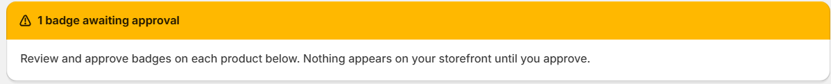
When there are badges waiting for your approval, a yellow/amber banner appears at the very top of the Badge Management tab. It shows the number of badges pending and a reminder:
Review and approve badges on each product below. Nothing appears on your storefront until you approve.
This banner only appears when at least one badge needs your action. It disappears when all badges are approved or rejected.
Approval Mode
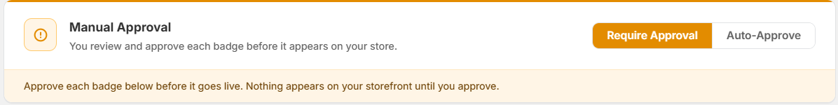
The Manual Approval section controls how badges are published to your store.
Mode toggle — two buttons side by side:
- Require Approval — amber/orange filled button when selected. You manually review and approve each badge before it goes live on your storefront.
- Auto-Approve — white outlined button when not selected. Badges are automatically published once verified — no manual step needed.
When Require Approval is active, an orange warning line appears below the toggle:
Approve each badge below before it goes live. Nothing appears on your storefront until you approve.
Regardless of which mode is selected, no badge is visible to customers until it has been approved — either by you manually or automatically.
Theme Widgets
Theme Widgets are the visual components that appear on your Shopify storefront. There are two widgets available.
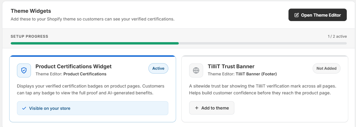
Open Theme Editor button — dark button in the top right. Clicking this opens the Shopify Theme Editor where you can position and configure the widgets on your store pages.
Setup Progress bar — a horizontal progress bar showing how many of the two widgets are currently active (e.g. 1 / 2 active).
Product Certifications Widget
- Theme Editor section: Product Certifications
- Status badge: Active — widget is installed and showing on your product pages
- What it does: Displays your verified certification badges directly on product pages. Customers can tap any badge to view the full verification proof and AI-generated benefits.
- Confirmation text: "✓ Visible on your store" in green — confirms the widget is live
TilliT Trust Banner
- Theme Editor section: TilliT Banner (Footer)
- Status badge: Not Added — widget has not been installed yet
- What it does: A sitewide trust bar showing the TilliT verification mark across all pages. Builds customer confidence before they reach the product page.
- "+ Add to theme" button — outlined button. Click this to install the banner into your Shopify theme.
Dashboard Metrics
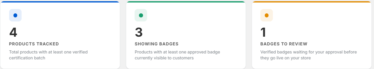
Three metric cards appear below the Theme Widgets section, each with a colored dot indicator:
| Dot | Metric | Description |
|---|---|---|
| Blue dot | Products Tracked | Total products with at least one verified certification batch |
| Green dot | Showing Badges | Products with at least one approved badge currently visible to customers |
| Amber dot | Badges to Review | Verified badges waiting for your approval before they go live |
Product Badge List
Below the metrics, each product in your catalog appears as a card showing its badge status and supply chain details. Cards are listed one per row.
Product card header
Each card starts with a header row containing:
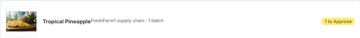
- Product image thumbnail on the left
- Product name in bold (e.g. Tropical Pineapple)
- Supply chain info in smaller grey text immediately after the name (e.g. FreshFarm1 supply chain · 1 batch)
- Status badge on the far right — a pill badge showing the overall approval state for that product:
- X to Approve — number of badges waiting for your approval
- X Live — number of approved badges currently live on the store
Per-product approval alert

When a product has badges ready to approve, an orange alert bar appears inside the card:
X badge(s) ready to publish. Approve to make them visible on your product page.
On the right of this bar is an Approve All dark button. Clicking this approves all pending badges for that product in one action.
Supply chain and batch rows
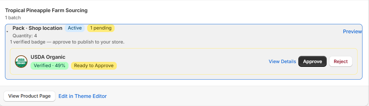
Inside each card, the supply chains and batches are listed:
- Supply chain name (e.g. Tropical Pineapple Farm Sourcing) in bold, with the number of batches below it
- Batch rows — each batch shows:
- Location path (e.g. Pack · Shop location)
- Active badge if the batch is currently active
- A small live/pending count badge (e.g. 1 live, 1 pending)
- Quantity — number of units in that batch
- Preview and Set as Active links on the right — Preview shows how the badge looks on the storefront, Set as Active makes this the displayed batch
Badge rows
Below the batch rows, each verified badge for that batch is listed:
- Certification logo — small circular icon on the left
- Certification name (e.g. USDA Organic, Non-GMO Project Verified)
- Verification score — e.g. Verified · 49%
- Status badge:
- Ready to Approve — verified, awaiting your approval
- Live on Store — approved and visible to customers
Action buttons on the right vary by status:
| Badge status | Available actions |
|---|---|
| Ready to Approve | View Details, Approve (dark button), Reject |
| Live on Store | View Details, Revoke |
- View Details — opens the full verification proof for this badge
- Approve — publishes the badge to your storefront
- Reject — removes the badge from eligibility
- Revoke — removes a live badge from your storefront immediately
Card footer links
At the bottom of each product card are two text links:
- View Product Page — opens the live product page on your Shopify store in a new tab
- Edit in Theme Editor — jumps directly to the widget placement for that product in the Shopify Theme Editor
Search & Filters

Above the product card list:
- Search bar — search by product name to find a specific product
- Add filter + — click to apply additional filters (by badge status, certification type, etc.)
Badge Verifications
The Badge Verifications tab shows all verified badges across all products in a flat table. This is where you manage the confidence threshold, run benefit generation, and do bulk badge approvals.
Verification metrics
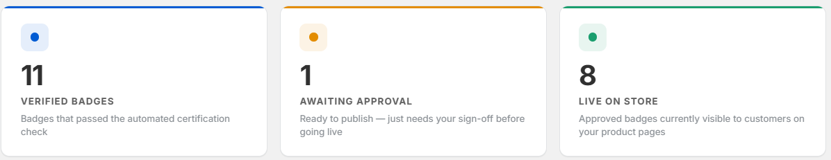
Three metric cards appear at the top of the tab:
| Dot | Metric | Description |
|---|---|---|
| Blue dot | Verified Badges | Badges that passed the automated certification check |
| Amber dot | Awaiting Approval | Ready to publish — just needs your sign-off before going live |
| Green dot | Live on Store | Approved badges currently visible to customers on your product pages |
Confidence Threshold
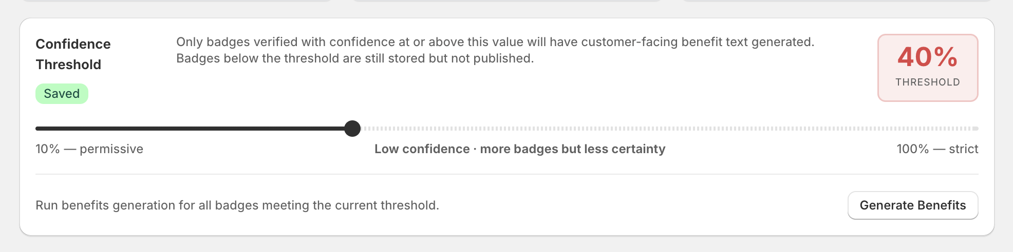
The Confidence Threshold controls which badges are eligible for AI-generated benefit text shown to customers.
- A horizontal slider runs from 10% (permissive) on the left to 100% (strict) on the right
- The current value is shown in a red/orange box on the right (e.g. 40% THRESHOLD)
- A Saved green badge appears when the threshold has been saved
- Helper text below the slider: "Low confidence — more badges but less certainty"
How it works:
| Badge confidence | Result |
|---|---|
| At or above threshold | Eligible for AI-generated benefit text and storefront display |
| Below threshold | Badge is stored but benefit text is not generated and badge is not published |
Lowering the threshold (towards 10%) means more badges qualify but with less certainty. Raising it (towards 100%) means only high-confidence badges qualify.
Benefits Generation
A line below the threshold reads:
Run benefits generation for all badges meeting the current threshold.
Generate Benefits button — outlined button on the right. Clicking this triggers AI benefit text generation for all badges that currently meet the confidence threshold. Benefit text is what customers see when they tap a badge on the product page.
Review & Approve Badges
This section shows all verified badges across all products in a flat table.
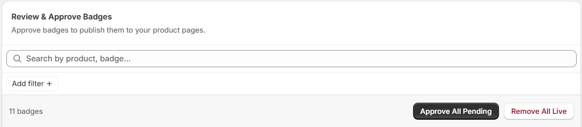
Section heading: Review & Approve Badges with subtitle "Approve badges to publish them to your product pages."
Search bar — search by product or badge name to find specific badges (placeholder: "Search by product, badge...").
Badge count — shows the total number of badges in the table (e.g. 11 badges).
Bulk action buttons (top right of the table):
- Approve All Pending — dark button. Approves every badge currently in Pending status across all products in one click.
- Remove All Live — outlined button. Revokes all currently live badges from the storefront in one click.
Table structure
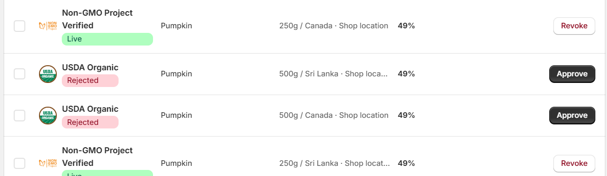
The table has a checkbox column on the left (for selecting individual rows) and five columns:
| Column | What it shows |
|---|---|
| Certificate | Certification logo + name + status badge stacked |
| Product | The product this badge belongs to |
| Batch | The specific batch (e.g. 250g / Sri Lanka · Shop location) |
| Confidence | Verification score as a percentage (e.g. 49%) |
| Actions | Buttons to approve, reject, or revoke |
Status badges in the table
| Badge | Colour | Meaning |
|---|---|---|
| Live | Green | Approved and visible on your storefront |
| Pending | Amber | Awaiting your approval |
| Rejected | Red/pink | Failed validation or manually rejected |
Row-level actions
Actions shown per row depend on the badge status:
| Badge status | Actions shown |
|---|---|
| Live | Revoke (outlined red button) |
| Pending | Approve (dark button) + Reject (outlined button) |
| Rejected | Approve (dark button) |
Was this page helpful?